The unexpected controversy over the “US” markings has been a total surprise to me. Even photos of piles of original gear, showing a wide range of variations of the markings, has simply prompted more questions. Why this year (2023) has seen a sudden fixation on them is a mystery.
So, here are more photos as well as WWII documents to show and explain how and why they really were.
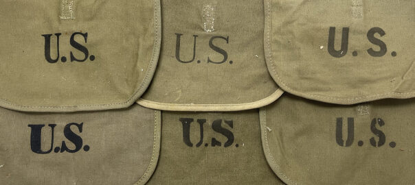
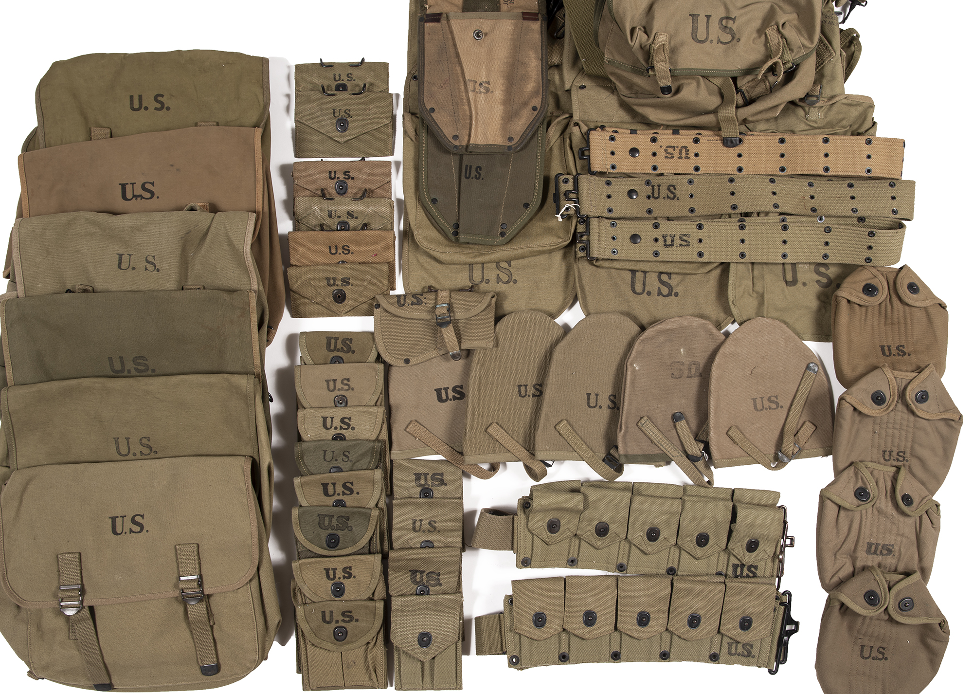
The photo: These are some of our originals. Most of the gear shown above is in unissued condition- therefore the markings are not faded nor redone, retouched or enhanced. This is how it looked when it was new and handed to the soldiers.
Points of interest:
-There are hardly any two fonts that are truly identical. Fonts with serifs are most common, but several without are present.
-Some are bold, some are not. Letter spacing, thickness and shape varies. Note the “S” on the pistol belt that looks like a “Z”.
-Maybe half are truly black and solid, others not, and it’s not terribly uncommon for part of the marking to darker than the others.
-Some aren’t perfectly centered and a few might even be crooked.
-Note that two are upside down, and one was forgotten entirely. (The pistol belt isn’t upside down, the stencil is.)
-In other words, perfection is not the rule.
All of the above original characteristics have prompted the following comments:
“This cannot be to “spec”! How could this have been allowed to happen?”
“I would expect more from American made!”
“Too light/ dark/ thin/ thick/ uneven (insert adjective)!”
“The military is all about precision!” (Yup. Lowest bidder.)
Ultimately, just about everything enthusiasts claim to be wrong about the U.S. markings- isn’t. At least not historically speaking.
“Specs”
Much is often bandied about “original specs” for this or that. Luckily, the QMC specifications for most items of WWII gear are available.
Here are a few examples from the US Army Quartermaster Corps specifications from the early 1940’s regarding the markings applied to the field gear issued to American soldiers.
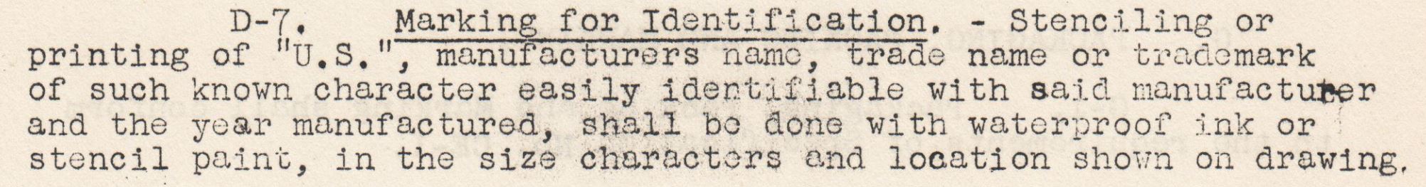
The specification sheets vary a bit, but follow the same general format. Typically, one will find this information in a paragraph titled “Marking for Identification” which covers the “U. S.” marking as well as that for the manufacturer’s information.
However, on a few items, it’s not addressed at all- yet the items still have markings.
In contrast to today’s rigidly formatted “gubmant speak”, the wording and amount of detail in the WWII specs varies widely. Here are a few examples.
First up, least pleasing for regulation maniacs, we have the paragraph used on M1 Carbine Pouches, spec 98, dated April 3, 1942. (The identical paragraph appears in the spec for the M1923 Cartridge Belts as well.) Not exactly detailed is it?
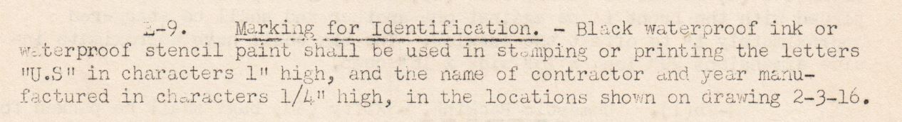
The next example is for Canteen covers, Spec. 1B, January 23, 1942. At least they give the size of the letters this time- but the color of the ink or paint is no longer mentioned…
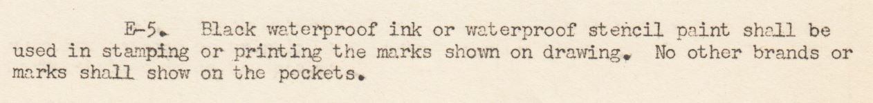
The final example is for M1943 Intrenching Shovels (folding shovels) and this one is on the more detailed end of the spectrum. In addition to the height of the letters, it also specifies that they be in “solid” face. (Sheets for some items say “bold face”.) This is about as fancy as it gets, even though again, they forgot to tell us that the markings should be black.
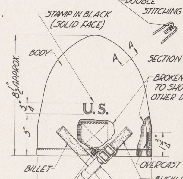
This is a typical drawing attached to the spec sheets. It does helpfully gives the location, size and color of the letters. Some drawings simply show the letters but have no other details about them. Most of the drawings do show them in a font with serifs, but the font style is never mentioned in any of the specs.
Proofreader needed! The first spec I looked at was for the Musette Bag- imagine if we followed this spec to the letter- or shall I say the lack of the second period. But there it is, in black and white from Spec. No. 20A, March 1944.
The Facts are thus:
Fonts were not specified: As stated, the letter style is never mentioned in any of these specs. Although most drawings show letters with serifs, a quick look at originals will show that there was a lot of flexibility. At no point are is any mention made of the spacing of the characters either.
Saturation was not specified: The closest one comes to finding out how thick or dark the marking should be is some of the sheets specifying “bold” or “solid” face letters.
At no point do any specs describe how thick, dark, light or evenly distributed the ink should be. Simply “waterproof ink or stencil paint.”
Many don’t even mention the color.
The Specs weren’t always adhered to: Outrageous as it may be, it’s not difficult to find originals with letters not sized or located in accordance with the drawings in the specs. The horror!
Defective: Nowhere does it state that an imperfect marking is grounds for declaring an item ineligible for combat duty.
Ultimately, the obvious fact is that military simply wasn’t that worried about how pretty or perfect the two letters stenciled on their backpacks and shovel carriers were. They had other priorities.